Company: For The Record
Year: 2016-2019
Tools: Figma, Photoshop, Illustrator, Workshops
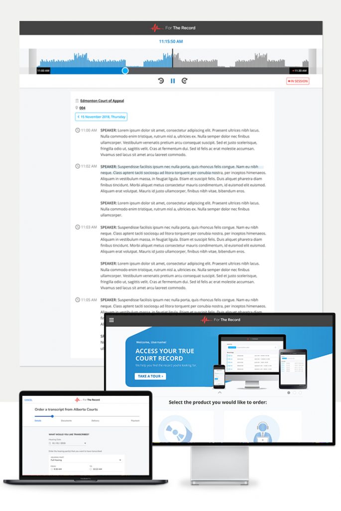
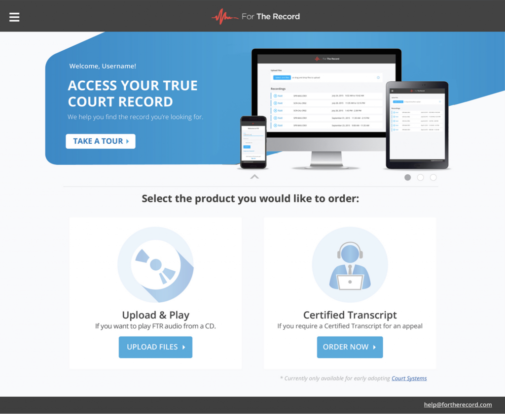
Project Info: UX/UI and Visual Design work for multiple digital products such as: FTR Gold, Court.FM, LiveCopy, etc. And the design of FTR Platform; a responsive and cloud-based platform that allows lawyers, judges and other law industry professionals to access court records & interactive transcripts.
URL: https://app.fortherecord.com
THE WORK:
UX / UI Design – Improving the look & feel and Reducing Inconsistencies
Initially I joined the company to help streamline the look & feel of all digital products, the issue was that we had some products with a look & feel from decades ago and others were designed only months ago. This was an excellent approach to get familiar with the products, company and the process.
Design outcomes: Skin redesign of FTR Gold. New features and visual improvements on different FTR digital products.
Prototyping – New product and introducing IA
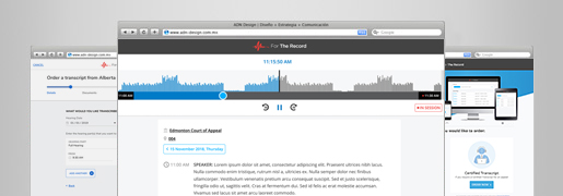
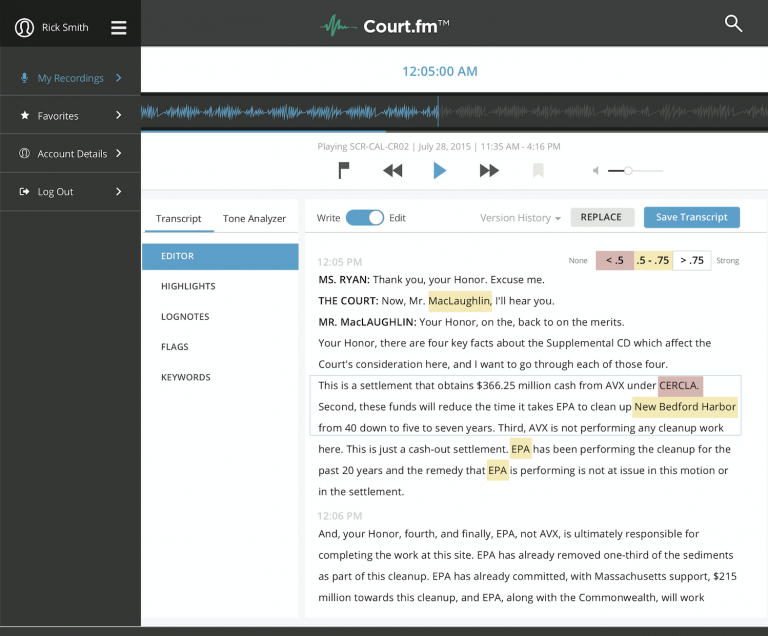
After our CEO found a potential business opportunity by injecting IA into our products, I embarked into creating an initial prototype to explore the possibilities of what a future product could look like. This prototype was taken to the next level by the dev team that created an interactive prototype which was tested at conferences with high caliber customers.
Design outcomes: This interactive prototype is still used in sales and conferences to this date. It generates both insights and business opportunities to the company.
Iterative Design – From Prototype to Adoption
A successful prototype meant having our first (local & international) customers and many features to design, build, release and test. I worked closely with the dev team using an Agile approach. Handing over wireframes, high definition designs, annotations and doing quick design reviews before PRs to be able to build the product at a fast pace.
Design outcomes: The design process is still in place. And current features are used as foundation/UX research for any design decisions done.
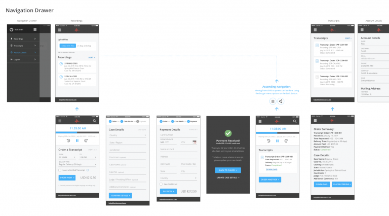
Mobile First – Responsive Design
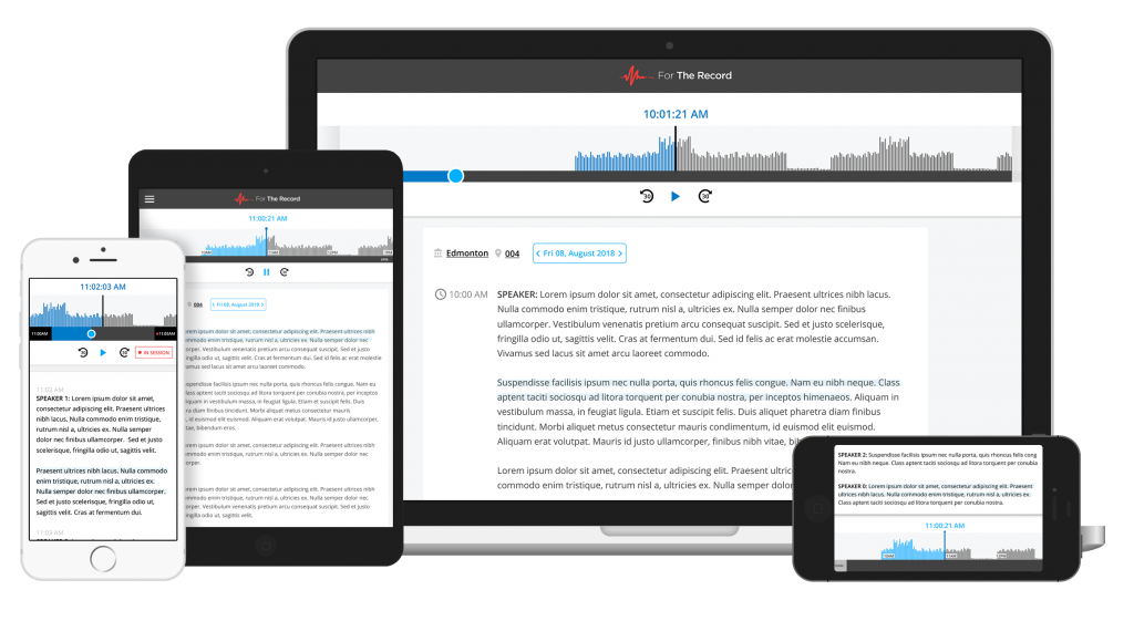
An issue I put my focus on was to change the approach from single-device products to responsive, mobile first designs that would work well for most devices. This avoids the creation of multiple products that do the same thing but for different devices.
Design outcomes: Every screen works on mobile, tablet, desktop and the process is built-in the team now.
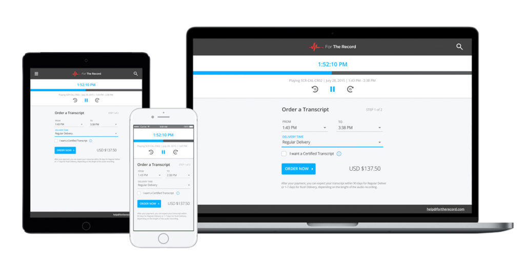
Form Redesign – From single page to multi-step form
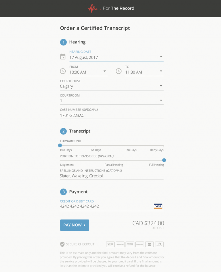
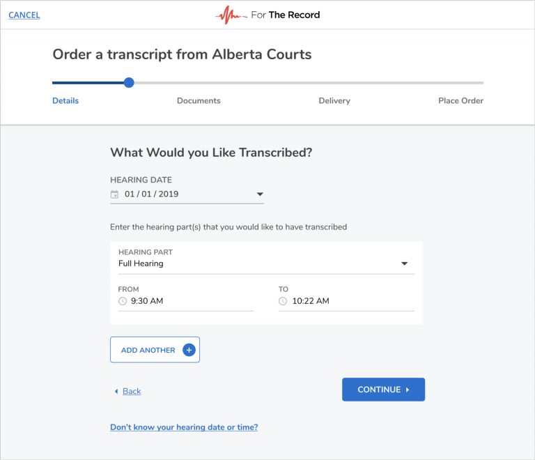
Initially, the main purpose of the forms in the application was to capture new users so that meant designing really friendly, single-page, easy to use forms that reduced the friction between new users and our platform. But as with any project, we found from the support tickets and analytics that we could improve and we changed from a single-screen form to a multi-stepper using ’topics’ to break steps into meaningful chunks that felt easier to complete.
Design outcomes: The positive feedback we received was immediate and we confirmed it with admins and clerks working in the process, that received less incomplete or inaccurate data.
Design System – Building a visual Language
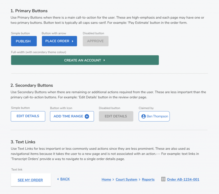
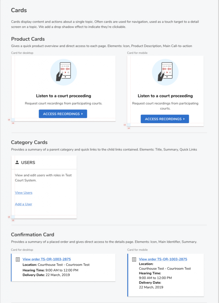
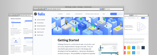
Even with a new platform, keeping consistency was proving to be a challenge after a couple of years. So, reviewing our collective work we decided to make the goal of creating a design system and release updates on both the system and the FTR platform at the same time. The entire design & dev team were involved. We took the Atomic Design approach to create a unified design language.
Design outcomes: This design system is still in place and being used by the team to reduce development time and visual inconsistencies.
